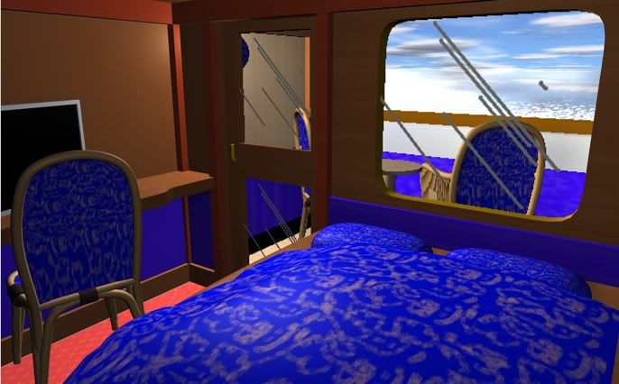
I love it. Looks classy.
I love that floor design with that blue stripe. Reminds me of something.


Looking at the size of the furniture, it seems to look a bit large/high. Making the cabin look small easily and sometimes cluttered.
I made such mistake when I designed my first cabin back in '07:

Looking at a real cabin (from the real P&O Oceana)

The room size is pretty much the same, yet it looks bigger.
The following dimensions might help you with getting an idea of size. It's what I use for my designs:
.Minimum seat height 45CM
.Average bed height (no mattress) 40CM
.Dressing table height +- 70CM
.Saloon table height 30CM
.2 Person bed size (Width X Length) 160 X 200 (I'm a large person so I prefer this size if not bigger)
.Minimum width of corridors or walkable space between high objects 60CM
.Minimum width of walkable space between low objects (E.G. between chairs and saloon table) If possible, try to stick with the 60CM rule.
.Minimum desk/dressing table depth 60CM
.Private promenade depth +-1.5 meters
.Railing height 1.2 meters
Of course, these are just mere guidelines. But they give you a nice impression of the scale of things.
One other tip, I would keep the forward area of the cabin reserved for a place to sit, move the bar to the back side of the cabin and make it less deep.

